
Museums on Twitter: Three case studies of the relationship between a museum and its environment
Alex Espinós, La Magnética, Spain
Abstract
In 2014 at the Museums and the Web conferences in Baltimore, Maryland, and Florence, Italy, we presented our report on how two thousand museums were relating on Twitter. After our presentation, we decided to continue our investigation in two directions: The first are the case studies. We wanted to analyze some museums' Twitter environments: how museums are relating to their followers, how they form different communities defined by underlying relationships, the growth of the network around a museum, detection of influencers, etc. We also wanted to study how to use this information in order to design better social-media strategies for an improved and more realistic assessment of the work and actions’ results on Twitter. Our case studies are London's Victoria & Albert, Turin's Palazzo Madama, and Barcelona's Center for Contemporary Culture. We have chosen museums with different Twitter strategies, countries, languages, and follower bases ranging from 7,000 at the time of writing this abstract (Palazzo Madama) to the 450,000 from V&A. The goal is to have different situations represented and run a useful research for museums of different sizes. The second direction is how museum professionals are interacting with each other on Twitter thanks to the use of hashtags, like #musetech, in order to share information, questions, and experiences.Keywords: Social Network Analysis, Social Media, Twitter
1. Introduction
During the Baltimore and Florence Museums and the Web conferences in 2014, we presented a report on how two-thousand museums worldwide related on Twitter during a whole year (to download, go to http://www.lamagnetica.com/twitter-museum-study/). We analyzed the most influential museums on Twitter, the factors underlying the observed community structure, the evolution of museums’ Twitter use during the study (with the awakening of Italian and French museums), and the museums that worked as a hub connecting communities from different countries.
That was the first part of a broader research that we are continuing in this paper. We will analyze the structures, dynamics, and features of the communities around museums on Twitter through three case studies. The focus is now on the relationships that a museum establishes with the people, and in the relationships among them.
These three case studies have different features and are based on seven months of data (from June 1 to December 31, 2014):
- London’s Victoria and Albert (V&A), a world-class museum that at the time of closing this paper has 524,000 Twitter followers.
- Torino’s Palazzo Madama, a medium-sized museum that is playing an important role in the Twitter engagement of Italian museums. It is the only Italian museum that was part of the core four hundred–museum graph in the paper we presented in 2014.
- Barcelona’s Center for Contemporary Culture (CCCB), which has an interesting strategy of multi-profile Twitter communication and a high degree of engagement. It serves also as a case study for museums with a separated educational profile. CCCB has eight different Twitter profiles totaling over one-hundred-thousand followers.
We have analyzed these three cases (diverse in terms of size, language/country, strategy, etc.) with Social Network Analysis techniques. We have chosen three distinctive cases to show these techniques in action over different situations and help museums to draw conclusions from the cases that more closely resemble their situation.
We analyze the first case in more detail; in the other two, we focus on their main differences from the V&A Twitter environment to show their distinctive features.
We seek to understand the relationship patterns between a museum and its engaged users, and the relationships among these users; and to detect communities and influential users that do not belong to any community within their environment, but are key to reach in order to spread your tweets through to new audiences.
More important, we want to show a different approach to thinking about Social Network Analysis, going beyond aggregated values such as number of followers, likes, or retweets: an approach that focuses on the networked nature of social media that cannot be grasped with these aggregated values. This approach is useful not only for large museums (such as the V&A case) but also for small and medium-sized museums.
As a result, we want to introduce the reader to a different set of concepts and tools for defining better and more informed strategies on Twitter and other social networks, and for assessing your actions’ results. The concepts used derive from different disciplines: graph theory, sociology, and, to a lesser degree, probability theory and game theory. All belong to a new discipline that has emerged in the last few years—network science—that has applications in many fields, including social networks (online and offline). In this paper, we have intentionally avoided mathematical formalism and centered the concept’s descriptions on the intuitions behind them.
This approach can help museums to better set their social network strategy and to find more effective ways to achieve their goals. It also helps to answer questions that arise in our daily work on social networks: whom are we reaching? How can I get to users outside my community who may be interested in the museum’s activities and social-media publications? Do local communities engage with the museum? Do communities of art lovers engage with the museum? If not, how can we fix this situation? Do we have to set up a different Twitter account for the educational department or for the press department? Do we need a social CRM (customer relationship management system) to properly manage our community and make the most of our social network’s presence? The paper cannot offer conclusive answers to these questions, as the answer depends on the museum’s goals, characteristics, and resources, but offers a set of concepts and examples that may be useful to help museums to find their own answers.
This is an ongoing study, and we will keep on gathering data for a period of up to one year.
We will devote the last part of the paper to present some results of the informal network of museum professionals interested in IT, analyzing the interactions in tweets with the hashatgs #museumtech and #museweb.
All the graphs published in this paper, and other graphs illustrating the different communities of the analyzed museums, are available in high resolution (9,000 by 6,000) at http://bit.ly/mtw2015.
The raw data is also available to anyone interested. Just keep in mind that by the end of the study, we will have about fifty-million tweets and over 650 gigabytes of data.
2. Case 1: Victoria and Albert
Let’s start with some figures to grasp the dimension of Victoria and Albert (V&A) on Twitter, the largest Twitter account we are analyzing.
The V&A has 525,000 followers (as of January 31, 2015), and have been growing at a rate of around 20,000 new followers a month. In some respects, the position of the Victoria and Albert is similar to that of a celebrity. It is impossible for their Social Media team to talk to a significant percentage of their followers, or to reply to every mention. So, in this case, the bidirectional communication between the museum and its community—which is one of the features of social networks a museum may be interested in—is strongly limited by the size of the community. It is the price of their success, and it is a situation shared by museums with a number of followers of a similar or greater magnitude.
During the seven-month period analyzed in this paper, the V&A has interacted with almost eighteen-thousand users on Twitter. This figure includes the users that the museum has mentioned or retweeted, as well as those who have mentioned the museum or retweeted one of its tweets. As we did in our MW2014 paper, we focus on actual relationships and not on who follows whom, as it is a much more reliable and data-rich way to analyze interactions and their intensity. In the MW2014 report, we showed that every museum analyzed followed an average of around one hundred museums but talked only to an average of fifteen during a twelve-month period. Some of the communications consisted of dozens of reciprocal mentions or retweets, but others only involved a single one-way mention during a whole year.
Those eighteen-thousand users with which the museum has interacted represent 4 percent of their average number of followers during the analyzed period. It is a significant number for a community this size. To grasp the meaning of this result, we need to compare to museums with a follower count of the same magnitude. We cannot compare with our other two cases: CCCB or Palazzo Madama—which has around eight-thousand followers and is connected with around 25 percent of its users—as this percentage is impossible with half a million followers.
Engagement indicators and their relationship with the community size
To better understand the meaning of this result, we have compared it with the mentions received in January 2015 by the museums that have between 250,000 and 1,000,000 followers (from those which have half of V&A followers to those which double it). There are twenty-one museums in this range (http://www.museum-analytics.org). We show them in figure 1, ordered by followers count (starting on the left with the museum with more followers):

Figure 1: mention rate of museums ranging from 250,000 to 1,000,000 Twitter followers
About one-third of the museums have a higher relative interaction than the V&A, whereas two-thirds have lower results. Among those that have greater interaction rates are some of the best-known (and most visited) museums in the world, such as the Met, the British Museum, and the Prado. The median is 1.13 percent, whereas the V&A rate is 1.46 percent (this is a one-month rate, and the 4 percent figure referred to seven months).
This leads us to a general rule: as our follower count grows, our total interactions grow (including retweets, mentions, and users we have related to), but the relative interaction rates decrease. This rule also applies to Facebook. Therefore, we can only compare engagement rates with other museums for which follower count is similar (as a rule of thumb, those that are in the range from half our follower count to those which double it).
Analyzing the Twitter conversation around V&A
Figure 2 depicts the conversations among Twitter users that have related to the V&A. As an 18,000-node graph is too dense to be readable and would require a huge image, we have selected only the most active users (filtered by their centrality; we will introduce the concept of centrality later on).

Figure 2: V&A Twitter environment (core graph)
Table 1 shows the main characteristics of the conversation around the museum. It includes:
- Retweets by V&A
- Tweets by V&A retweeted by other users
- Tweets with mentions of @V_and_A
- V&A’s tweets mentioning other users
- All users mentioned in any of these tweets
During the seven months we have analyzed the data, these 18,000 users have published over 17 million tweets that we have parsed. They contained almost 750,000 mentions to a user in our user’s set.
| Variable | Description | |
| Nodes | Number of different users that have interacted with @V_and_A | 17,991 |
| Edges | Unique connections among users, which means that if two users have interacted through many different tweets, we count only one. | 204,194 |
| Total connections (weighted edges) | Same variable as the previous one, but including all connections and not only unique connections. | 742,866 |
| Average degree | Average unique connections (edges) per user | 11.35 |
| Average weighted degree | Average total connections per user | 41.29 |
| Diameter | Maximum distance between two users in the graph, following the connections (most of them are one way) | 11 |
| Average distance between two users | 4.02 | |
| Clustering coefficient | A measure of the degree to which nodes in a graph tend to cluster together. Ranges for 0 (no clustering at all) to 1 (all users are connected to all users). Most of the museum networks we have analyzed are in the 0.1 to 0.3 range. | 0.248 |
Table 1: variables describing the graph of users connected to V&A
The V&A has connected with almost 18,000 users during the analyzed seven-month period. This represents around 4 percent of their average follower base during this period. This percentage is a meaningful measure, although some of the users may not be actual followers. For instance, some of them may have retweeted a tweet by the museum that they had discovered in their timeline because another user had previously retweeted it.
The number and averages of unique and total connections show us some interesting facts:
- These 18,000 users that have connected with the museums have an average of 11.4 unique connections within the graph and over forty-one total connections.
- Forty-one connections and 11.4 unique connections are large numbers that point to a significant degree of clustering; that is, of crossed interactions among users. All users in our set have interacted with the V&A, so they can have either one or two edges connecting them to the museum (two if the relationship is symmetrical, one if it is not). That means that the 18,000 users have an average of 9.4 to 10.4 unique connections with users other than the museum (the exact value is 10.3, as most connections are one way: the V&A is mentioned by over 17,000 users but has mentioned only 290).
- The value of the clustering coefficient along with these data shows us a network that grows more in density than in new users (nodes). This means that if we keep gathering data we are going to see an increase in the crossed connections among users in the list of 18,000 users that have been connected to the museum. This growth is likely to be more significant than the growth of new users that have been in touch with the museum on Twitter.
- The average distance shows us that most of the connections are asymmetrical.
The communities
Roughly speaking, a community inside a graph is a group of users that have strong internal ties, and lesser external ties to the rest of the graph. There are different procedures for analyzing them, and they lead to similar—but not identical—results. The procedures allow one community to be identified at each step, and the person analyzing the graph has to decide at which point it is wise to stop the process. The goal is to detect the groups that offer insights about the Twitter interactions around the museum.
In our case, 18,000 users allow a high-level approach, grouping the users in six large and clearly different groups. Splitting each group into several ones would have led to an even more detailed (and wordier) analysis.
The image above depicting the core V&A graph shows the six communities in different colors. Three of the communities of the image are easily identifiable in the graph image (two on the left and the red one on the right). The other three are not, as there are significant ties between users in these communities. Each community is named after the kind of users that more closely characterize it (table 2):
| Community (description) | User (nodes) | Inner unique connections (edges) | Average degree (unique connections per user) |
| Design | 4,421 (24.57%) | 16,185(7.93%) | 3.66 |
| Fashion | 2,724 (15.14%) | 14,031 (6.87%) | 5.15 |
| Journalism / newspapers | 3,080 (17.12%) | 20,423 (10%) | 6.63 |
| Arts and culture | 1,873 (10.41%) | 11,355 (5.56%) | 6.06 |
| Museums and galleries | 1,670 (9.28%) | 7,598 (3.72%) | 4.55 |
| Magazines (and leisure and lifestyle) | 1,236 (6.87%) | 9,461 (4.63%) | 7.65 |
Table 2: the main communities around the V&A
Over 80 percent of the users that have interacted with the museum are included in these six groups. The edge count is always lower because when splitting the graph into several groups all connections among users belonging to different communities are erased.
As the Victoria & Albert is an arts and design museum, some communities are shaped by its broad range and variety of collections. The museum’s extensive collection in different areas allows the museum to attract the interest of different topic-centered groups, such as the two larger communities:
- The larger one that we have called the design group (red) comprises one-quarter of the 18,000 users connected to the museum (see figure 3 for a graph isolating this community). Only the most relevant users have been included to make the graph more straightforward. High resolution of full and core graphs is available at http://bit.ly/mtw2015. If you are interested, do not hesitate to ask us for the lists of influential users in each community.
- The fashion group (green and orange groups, on the lower part of figure 4) is the second in users and third in edge (connections).

Figure 3: design community isolated. The image only contains the most active users (core graph).

Figure 4: fashion community (core graph)
The third group (light blue) is held together by some newspapers and broadcasters such as the Daily Telegraph and several BBC profiles. Most of the users are not newspapers or journalists, but the most relevant users of this group are, and many of the other three-thousand users are connected by means of their mentions to the papers, broadcasters, and journalists. As these mentions happen quite often on Twitter when tweeting about news, it is no surprise that the average degree of this group (unique connections per user) is higher than that of the two main groups.
The fourth group (yellow) is related to culture and also to some museums. It includes: Guardian Culture, Serpentine galleries, and some museums of the United Kingdom. The distinction between this group and the next one is not always clear. This group seems to be more UK-centered than the next one that includes more foreign museums and users. However, Twitter only offers information about the language most frequently used by a Twitter account (when there is such a main language), but not about the country. The distinction comes from the analysis of the link structure, so despite being museums in both groups they are two separated groups.
The fifth group (pink) comprises museums, art galleries, and people related to them on Twitter. Its most relevant users (in the group, not in absolute terms) are museums such as the Metropolitan, the Louvre, and the National Museum of American History. It also includes UNESCO and the art websites Artnet and Blouin Artinfo, art galleries like Victoria Miro, and several highly prolific art-lovers’ twitter accounts.

Figure 5: museum-related community (core graph)
The last group comprises magazines related to leisure and tourism (Time Out London and Evening Standard‘s Going Out guide), newspapers (Evening Standard), events (London Cocktail Week), and society magazines (HELLO!—which is also a hint about how people’s interests are mixed in social networks).
It goes without saying that groups with some 14,500 users are much more complex and can hardly be explained in a short characterization.
3. How does our follower base grow? Tips for our online strategy
In order to apply this Social Network Analysis approach to a social-network strategy, it is paramount to understand the dynamics of social networks and to focus on its evolution and trends. We must know the basic mechanisms by which our follower base grows, how to get awareness from users not following us, and how our information gets across Twitter (as this does not always happen).
There are different user behaviors and mechanisms that underlie this result (growth, awareness), and some of them are quite complex and related to the particularities of a specific social network. We have decided to focus on two of the main organic mechanisms: symmetry and triadic closure (figure 6). We differentiate organic growth from a growth coming from advertisement.
Symmetry or reciprocation is straightforward: if we follow a user, chances are he or she will follow back. This is useful for small-sized museums, local-interest museums, and those starting in a social network. But it is of no use for larger ones. Victoria and Albert follows only 1,200 users. Even if the museum can manage a 500,000-user list, it is not likely most users believe they have V&A’s attention. The situation is again related to that of a celebrity.
Symmetry is possible in Twitter, but not in Facebook, as Facebook pages receive likes or fans but cannot follow or like individuals.
The second mechanism, triadic closure, is much more interesting. Despite its simplicity, when applied to a complex network, it is a key factor for a museum follower’s base growth and awareness. Furthermore, with some particularities, it is shared by most social networks, including Facebook.
The notion behind the triadic closure is simple: if A is related to B, and B is related to C, it is quite likely that A is related to C or that they will become related in the future. The clustering coefficient we have shown before tries to formalize the “quite likely” in the previous sentence.
The more users connect A and C (the more triangles in which A and C are vertices), the more likely they are connected or will be in the future.
When we say that it is likely that A and C are related, we are speaking in relative terms, not asserting that there is a high probability but that the probability is higher than that of any random pair of nodes of being connected. In a large social network (either online or offline), one user is only directly connected to a small part of the whole network. As a consequence of that, this mechanism allows us to connect to a much wider audience. The triadic closure is also the system used by social networks when they suggest to us someone we may know on LinkedIn, a page that may interest us on Facebook, or profiles related with those we follow on Twitter; the more triangles are connecting us in a two-step path with this new user or page, the more likely the social network will suggest it.
The easiest definition of the clustering coefficient is:
Clustering = number of closed triplets / number of total triplets
where triplets are groups of three users connected, such as the A–B–C example. In an asymmetrical network like Twitter (the actions to follow, mention, or retweet need not be reciprocated), the casuistic of triplets is quite complex, and there are sixteen different kinds of triplets, but we will keep it simple.

Figure 6: triadic closure
One useful consequence of triadic closure for our Social Network Strategy
Quite often we focus only on the most active users within a community, or on the most influential ones within the conversation being analyzed. But one of the most useful approaches for organic growing is to detect users that are influential on Twitter but not in our environment. The best way to assess global influence is by using Klout, a free and widely spread tool that extensively uses the Social Network Analysis techniques shown in this paper. Indeed, Klout has access to Twitter’s Firehose (a data feed of all public tweets), which allows a very accurate influence assessment. Klout values range from 0 to 100.
A user belonging to one of the communities around our museums offers opportunities for growing and spreading our messages, but these opportunities are limited by the facts that we already have a significant number of followers in the community (otherwise they would not be a community) and that we usually have many redundant ways to get to the same users, as we have many shared connections.
Detecting influential users not belonging to a community around us (and hence not influential in our community) offers an opportunity to organically grow our community through the triadic-closure process. An important user outside a community offers from hundreds to millions of potential new followers through triadic closure, and also a large set of users that do not follow us but that can receive our tweets through the retweets of this user.
Figures 7 and 8 explain the process, where M is a museum and K the user out of our closest followers’ group, but with a high Klout score.

Figure 7: K is not related with the rest of our followers

Figure 8: K’s high Klout score guarantees a large set of engaged users around K. These users are now closer to us and offer a path for growing our followers’ base and spreading our tweets.
Influence and centrality in a graph versus number of received connections
Another concept is paramount to understanding the graphs: influence. Influence is related to centrality, which is the position that a node has in a graph. Influence and centrality are not exactly the same, but for the sake of simplicity we will treat them as synonyms. Although the math behind these two concepts is quite advanced–and there are several ways to measure graph centrality, depending on the highlighted feature–we have decided to present a naïve concept of centrality.
For the three case studies, we have used two different measures—PageRank and betweenness centrality—that result in similar but not identical rankings in the kind of graphs analyzed in this paper.
Figure 9 shows a graphical explanation of the naïve concept of centrality:

Figure 9: although F has more connections, A is the key node in this oversimplified graph.
4. Case 2: Palazzo Madama
Palazzo Madama is a very different case, as it is a much smaller museum with 8,150 Twitter followers. There are several relevant differences from the V&A. First of all, the V&A is located in one of the two cities with the most museums in our top-twenty Twitter influence ranking (the other being New York). Secondly, Palazzo Madama is in a country with a growing but still much lower Twitter use than the United Kingdom. Last but not least, the V&A communicates in English, while Palazzo Madama uses both Italian and English, depending whom they are addressing. The bilingual communication is reflected in the community structure around the museum, as we shall see later.

Figure 10: users related to Palazzo Madama (core graph)
Table 3 is the same as table 1, but with Palazzo Madama figures:
| Variable | Description | |
| Nodes | Number of different users that have interacted with @palazzomadamato | 1,891 |
| Edges | Unique connections among users, which means that if two users have related through many different tweets, we are counting only one. | 63,749 |
| Total connections (weighted edges) | Same variable as the previous one, but including all connections and not only unique connections. | 446,652 |
| Average degree | Average unique connections (edges) per user | 33.71 |
| Average weighted degree | Average total connections per user | 236.20 |
| Diameter | Maximum distance between two users in the graph, following the connections (most of them are one way) | 9 |
| Average distance between two users | 2.69 | |
| Clustering Coefficient | A measure of the degree to which nodes in a graph tend to cluster together. Ranges for 0 (no clustering at all) to 1 (all users are connected to all users). Most of the museum networks we have analyzed are in the 0.1 to 0.3 range. | 0.268 |
Table 3: variables describing the graph of users connected to Palazzo Madama
In this case, we have processed 2.4 million tweets published by the 1,900 users connected to Palazzo Madama during the analyzed time frame. The users around Palazzo Madama are more prolific than those around the V&A, as they have published 25 percent more tweets per user.
The degree and average degree are really high and point to a smaller but very active group (or groups) of people, which does not necessarily imply a very cohesive community, as we shall see. The V&A had an average of 11 unique connections and 41 total connections per user, compared to 34 and 236 in this case. Furthermore, the ratio between the two variables is also pointing to a difference in user behavior. In the case of the V&A, each connection was repeated an average of 3.6 times (41.29/11.35), whereas Palazzo Madama has a ratio of 7.0. That means that the ties in this smaller community are much stronger than in the case of the V&A.
However, which conclusions can we draw out of the two museums having a very similar clustering coefficient? Isn’t the V&A 0.25 for an 18,000-user set much more impressive than Palazzo Madama’s 0.27 for a user set ten times smaller? In our opinion, it reflects two facts. The first is that Palazzo Madama communicates in two languages, which naturally splits its community into two groups. The second and most relevant fact is that although there is a very active set of users talking to each other, this does not turn them into a more cohesive community.
The average distance between two users and the diameter (maximum distance) are smaller than V&A’s, but this is what could be expected from a smaller user set.
The communities around Palazzo Madama
There is an international museum-related group (mainly U.S. and UK profiles) on the top left corner of the graph (the Tate, the British Museum, Mar Dixon, Rijksmuseum, The Guardian). Figure 11 shows this community isolated (as in the previous examples, we show only the most active users, as more detailed images are harder to read).

Figure 11: international museum community around Palazzo Madama
The three main Italian communities

Figure 12: the Torino group

Figure 13: Italian group dominated by media

Figure 14: Italian group (with some foreign Twitter users), mostly centered on museums and culture
5. Case 3: A multi-profile strategy: Barcelona’s Center of Contemporary Culture (CCCB)

Figure 15: CCCB’s environment
In the CCCB’s case, we will focus only on two interesting facts.
The first one is the strong group (in green on the left hand side of figure 15) that has @ciutatmorta as its most prominent users. The tweets connecting these users are about a highly controversial TV documentary that got to be global-trending topic despite being on Catalan television. The documentary was previously exhibited in a CCCB festival. Most of the tweets were published in the week after the broadcast. Such a phenomenon introduces a distortion in the analysis of the community around the different CCCB’s Twitter accounts. However, we are pointing to it because this kind of phenomenon is not uncommon. Indeed, both news and a very successful marketing action or an opening can sometimes generate large numbers of tweets that may hide other more-constant but low-volume interactions that are more closely related with the museum’s core activities.
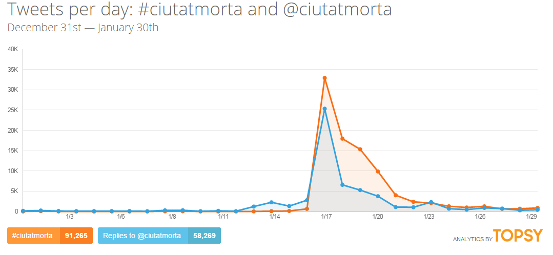
Figure 16: daily tweets with the hashtag #ciutatmorta and mentions of @ciutatmorta, the documentary’s Twitter account
The other interesting fact is the use of a multi-account Twitter strategy. Table 4 shows CCCB’s profiles and followers:
| Followers | Klout | |
| CCCB (major profile) | 78,685 | 65 |
| CCCB LAB | 19,282 | 62 |
| CCCB Educació (Education) | 6,373 | 56 |
| CCCB Debats (Lectures and Debates) | 852 | 53 |
| Kosmopolis (Amplified Literature Festival) | 5,195 | 56 |
| CCCB Música (Music) | 1,576 | — |
| CCCB premsa (PR) | 1,339 | — |
| Public Space (European Prize for Urban #PublicSpace) | 2,252 | — |
Table 4: CCCB’s Twitter acounts
Looking at the three main profiles, the total follower count ranges from 78,685 (complete overlap between the three accounts’ followers) to 104,370 (the addition of the followers from the three main profiles). The total count is 87,481, closer to the first figure. There is a significant overlap between the profiles:
- 66 percent of CCCB LAB’s followers are also followers of the main account.
- 36 percent of the educational account followers are also followers of the other two accounts, and 27 percent are followers of one of the other two accounts. That leads to only one-third of users who follow only the educational account.
The overlapping is not a flaw in the CCCB strategy, but it is a fact that must be taken into account when publishing, and also in the assessment of its real scope on Twitter.
6. The informal museum professionals community: #musetech, #museweb
To close this paper, we want to show some data about the informal community of Museum professionals interested in IT applied to museums: websites, apps, social networks, etc. This community relates to the more formal museums’ community analyzed in the Baltimore conference and in the abovementioned report.

Figure 17: core graph depicting the top seven-hundred users and their relationships

Figure 18: detail of the complete graph (4,556 users) highlighting a group of users belonging or related to the Met. This group is lost in the core graph, as only the most influential users of this group belong to the main graph.
The procedure to gather the data is different from that of the three previous case studies. In the case studies, we have been gathering daily all tweets from the analyzed museum, as well as all mentions of the museum. With this starting point, all the nodes in the graph are connected to a central hub, which is the museum. Then, at the moment of performing the analysis, we gather all tweets published by these nodes (those that have mentioned the museum or been mentioned by it) in our time frame to get all crossed mentions between the nodes.
The case of #musetech and #museweb is different. We have gathered all tweets with either of these hashtags, and then we have looked for connections between users contained in those tweets. It is a less data-intensive procedure, but it usually takes more time gathering data to get a dense enough graph to draw interesting conclusions from it, as such a graph tends to be much more scattered.
This is exactly what has happened in this informal museum community analysis. After eight months (from June 2014 to January 2015), we have collected 10,630 tweets published by 3,801 users but involving 4,556 Twitter users (the difference is due to the users mentioned in these tweets who have not tweeted with any of the hashtags).
Table 5 shows the basic graph data (without the variable definition):
| Complete Graph | |
| Nodes | 4,556 |
| Edges (unique connections) | 12,797 |
| Connections (=weighted edges) | 31,924 |
| Average degree | 2.81 |
| Average weighted degree | 3.50 |
| Diameter | 11 |
| Groups of connected users | 47 |
| Average distance between two users | 3.84 |
| Clustering coefficient | 0.31 |
Table 5: variables describing the graph of users and tweets with the hashtags #musetech and #museweb
This graph leads to some straightforward remarks:
- Tweets contain an average of three mentions (including those from the retweets). This is a natural result in tweets with hashtags meant for triggering conversation among museum professionals. This is much higher than the results of the three case studies.
- The average degree is quite low, due to the procedure followed being different from the three case studies. We are not processing every single tweet between any pair of users, but only those tweets with any of the hashtags.
- We have introduced a new variable, the number of components, which did not make sense in the three case studies (by means of the procedure followed—called snowball sampling—all users are connected in a single component), but that is relevant in this case. There are forty-seven unconnected groups of users in this graph. Although most users belong to the main component, there are forty-six smaller and disconnected components whose nodes have not connected with any user of the main one in a tweet with the hashtag during the eight months analyzed.
The top twenty users in this community have been defined according to two criteria: influence and the number of received mentions.
| Influence | Received Mentions | ||
| 1 | museweb | museweb | |
| 2 | museumnext | museumnext | |
| 3 | sree | metmuseum | |
| 4 | metmuseum | sebchan | |
| 5 | wsj | sree | |
| 6 | sebchan | museumcn | |
| 7 | mia_out | mia_out | |
| 8 | donundeen | rosemarybeetle | |
| 9 | museumcn | svegliamuseo | |
| 10 | mountvernon | nealstimler | |
| 11 | gwbooks | danamuses | |
| 12 | rosemarybeetle | nancyproctor | |
| 13 | nealstimler | roblancefield | |
| 14 | danamuses | ukmcg | |
| 15 | nancyproctor | donundeen | |
| 16 | nickpoole1 | wsj | |
| 17 | svegliamuseo | smkmuseum | |
| 18 | roblancefield | cooperhewitt | |
| 19 | cooperhewitt | v_and_a | |
| 20 | cooperhewittlab | ||
Table 6: top twenty users: influence and received mentions
The two lists are alike but have significant differences. The top two are the two main IT-focused museum conferences, and in the ninth place is the Museum Computer Network. Some museums are also active in the community (The Metropolitan, V&A, Cooper Hewitt, George Washington’s Mount Vernon house, and library profiles). There are also participative and influential professionals from these and other museums: Sree Sreenivasan, Don Undeen and Neal Stimler (Met), Seb Chan (Cooper Hewitt), Dana Allen-Greil (National Gallery), Andrew Lewis (V&A); and Nancy Proctor (Museums and the Web, Baltimore Museum of Art).
We can also find university researchers (Mia Ridge), the Italian collective Svegliamuseo, and private companies (Nicholas Poole and Rob Lancefield, also former president of MCN).
An important feature of the conversation around #musetech and #museweb is that the main component forms a unique community. It would be useless to define sub-communities with the abovementioned procedures.
We can draw two conclusions from these facts. The first is that museum professionals that are interested in IT and part of this conversation form a cohesive group. This contrasts with the country-shaped community structure we found when analyzing interactions between museums. The second fact is that most of the users and museums in the graph are from the United States, the United Kingdom, or other English-speaking countries, the only exception being Svegliamuseo. There are some users from other countries, but they do not achieve an influential place in the community. The reason why they do not form country-based groups is probably that if they are tweeting with these hashtags, their intention is to be in touch with their colleagues abroad. Indeed, museum professionals use other local hashtags when they want to talk about IT topics within the same country.
7. Conclusions
Through the three case studies we have seen some of the main Social Network Analysis concepts in play. We have tried to use them to highlight features of each museum environment that are not easily captured with the aggregated variables commonly used for analyzing social networks. We have explored three different situations so each museum can choose the case or the situation that more closely resembles its own.
Moreover, the concepts and techniques presented may be useful for museums to set their tactics to achieve their goals in social networks and to analyze their performance.
Acknowledgements
I want to thank all the members of LaMagnética’s team that has helped me with the paper: Marc Espín, Arnau Codern, and Eduard Almacellas played a significant role on gathering data on the early stages of the project; Carla Oliver has done an extensive job processing the data, coding, and drawing the graphs with Gephi, and has also reviewed the paper; Elisa Rabate has helped me with correcting the text; and Silvia Trillo, who has reviewed the paper and has made useful suggestions to improve it.
References
Barabasi, A. (2012-15). Network Science. Center for Complex Network Research Northern University. Last consulted January 30, 2015. Available http://barabasilab.neu.edu/networksciencebook/
Barabasi, A. (2014). Linked: How Everything Is Connected to Everything Else and What It Means for Business, Science, and Everyday Life. Basic Books.
Bondy, A., & U. S. R. Murty. (2008). Graph Theory. Springer. Graduate Texts in Mathematics series.
Easley, D., & J. Kleinberg. (2010). Networks, Crowds, and Markets: Reasoning About a Highly Connected World. Cambridge University Press.
Espinós, A. (2014). Do Museums Worldwide form a true Community on Twitter? Some insights on the museum Twitter ecosystem through Social Network Analysis and Network Science. Last consulted January 30, 2015. Available http://www.lamagnetica.com/twitter-museum-study/
Golbeck, J. (2013). Analyzing the Social Web. Morgan Kaufmann/Elsevier.
Granovetter, M. (1973). “The Strength of Weak Ties.” The American Journal of Sociology 78(6): 1360–1380.
Granovetter, M. (1983). “The Strength of Weak Ties: A Network Theory revisited.” Sociological Theory, volume 1, 201–233.
Jungnickel, D. (2013). Graphs, Networks and Algorithms. Springer (Algorithms and Computation in Mathematics series).
Newman, M. (2010). Networks: An introduction. Oxford University Press.
Tsvetovat, M., & A. Kouznetsov. (2012). Social Network Analysis for Startups. O’Reilly.
Cite as:
. "Museums on Twitter: Three case studies of the relationship between a museum and its environment." MW2015: Museums and the Web 2015. Published January 31, 2015. Consulted .
https://mw2015.museumsandtheweb.com/paper/museums-on-twitter-three-case-studies-of-the-relationship-between-a-museum-and-its-environment-museum-professionals-on-twitter/